The Power of Color in Photography 🎨 📷✨
and the personalities of the colors we love.
Color is a powerful visual language. The intentional search for and use of color is one of photography's most underrated tools.
In a previous Substack note, I mentioned my affinity for color; I said I photograph color more than I do whatever interesting subject crosses my path. The more deeply I thought about it, the more I realized color is a subject. It is a very compelling subject that has the power to stand on its own.
Many masters of photography who inspire us have effectively used color to communicate through their work!
Like William Eggleston
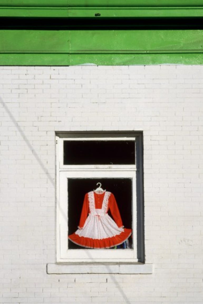
Or Fred Herzog
The psychology and science of color have been studied intensely over hundreds of years, and there are many subjective truths on how color impacts our actions, emotions, appetites, and more.
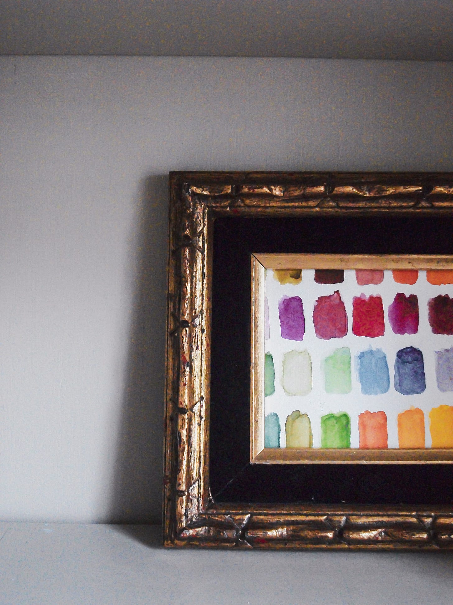
The beautiful thing about color is that black-and-white photography is not exempt from this conversation. Color adds contrast to black-and-white photos. So, if you’re a black-and-white photographer, I welcome you to participate in the dialogue.
We can literally get lost in the world of color.
Color is an onion; there are many layers to it. So, instead of bombarding your senses all at once, color in photography will be one of those subjects I slowly unpack here on my Substack.
This is only the beginning.
I hope this conversation enlightens you and that you find yourself searching for color and becoming more aware of its impact on your photography.
But first, What is color?
Simply put, color is what our eyes see when light reflects off an object. However, the translation of color varies from person to person. For example, I may see red differently than you, or those with a color vision deficiency may not see specific colors at all.
The personalities of colors.
And yes, it’s just like humans having personalities.
There's a caveat: While most of these personalities are universal, culture impacts additional meanings. Additionally, changing the hue/tone/tint of color takes on a different personality(we will discuss this another day).
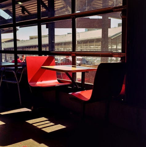
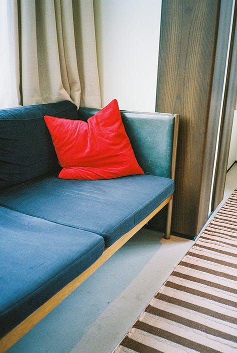
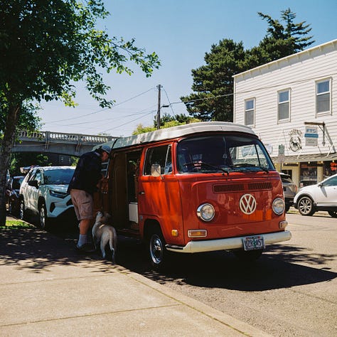
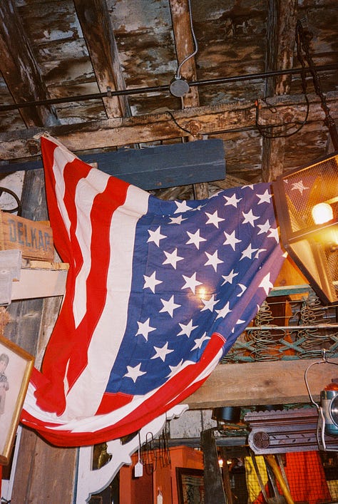
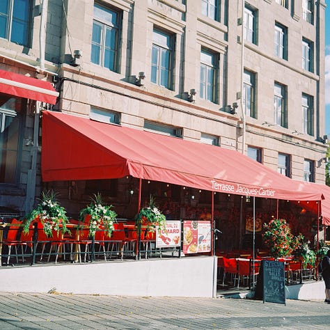
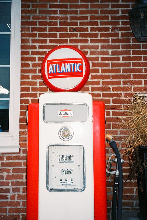
The personality of RED
Love, Passionate, Excitable, Dangerous
The color red elevates breathing and heart rate, so if you’re trying to make an impact, may red find you.
Marketers have found that red encourages people to buy, hence Target’s(a popular U.S. retailer) overuse of red in its stores.



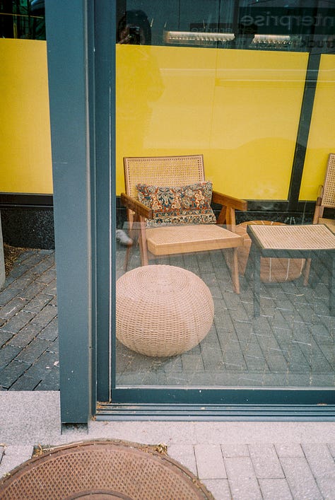
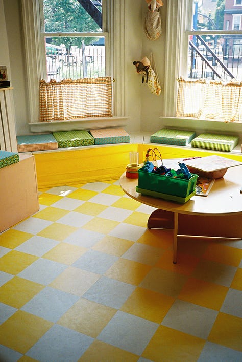
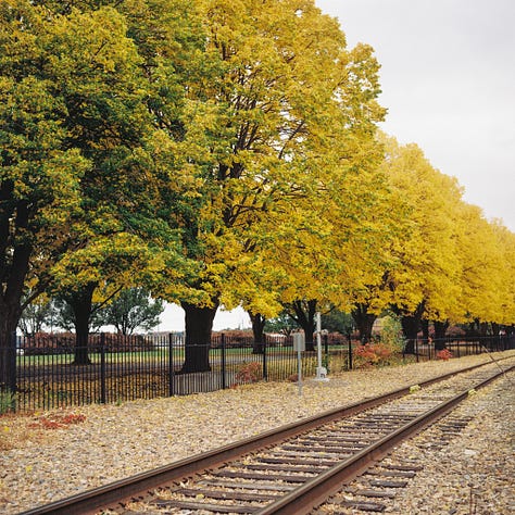
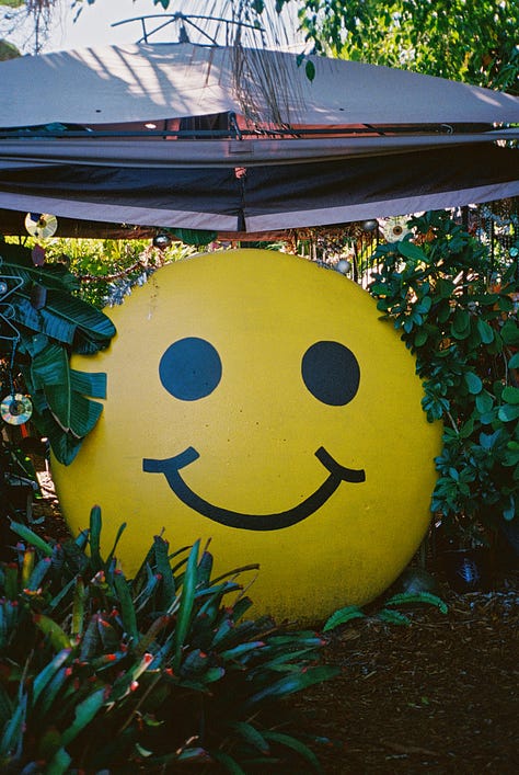
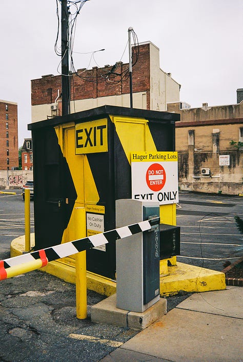
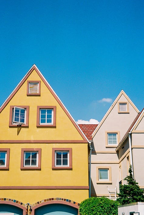
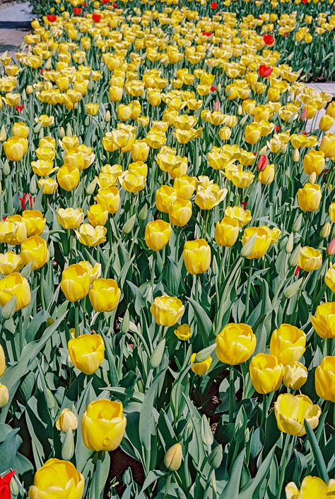
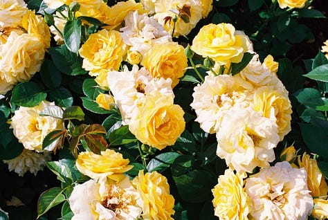
The personality of YELLOW
Optimistic, Joyful, Prosperous

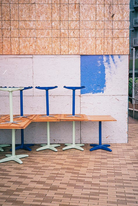
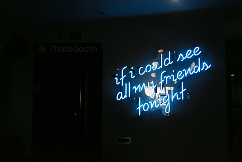
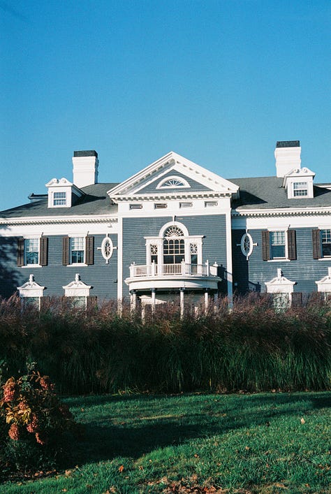
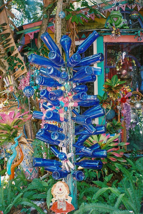
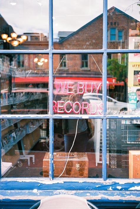
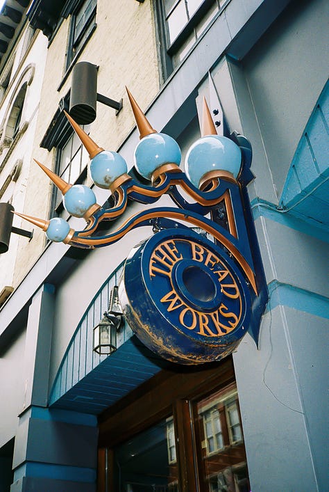
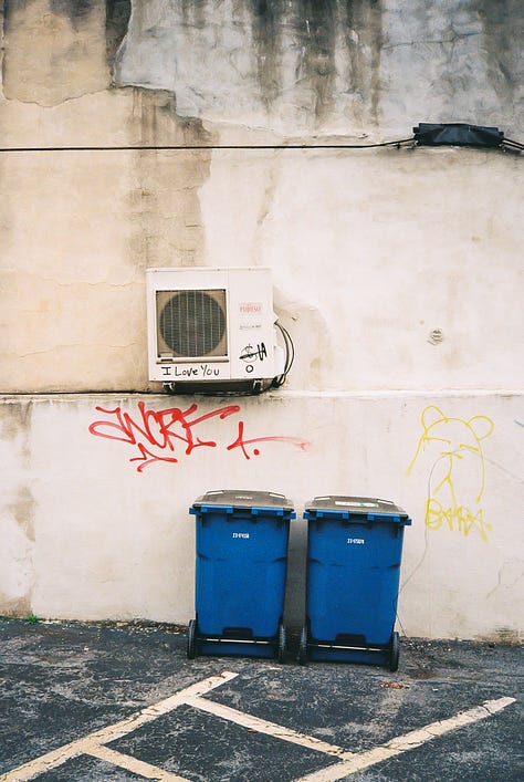
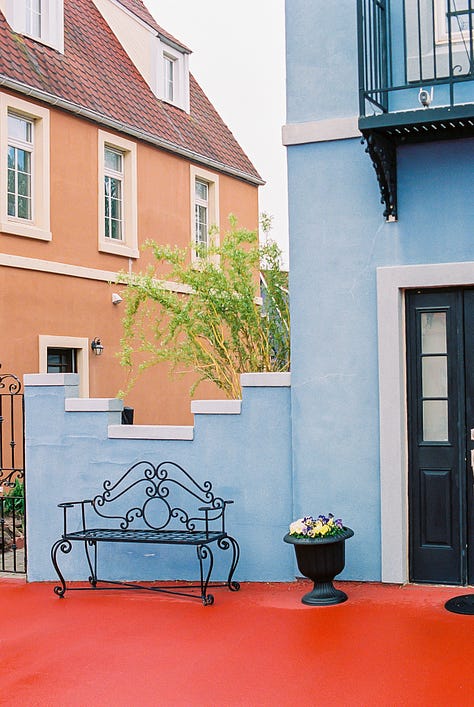
The personality of BLUE
Dependable, Trustworthy, Serene, Loyal, but also Sad and Depressed
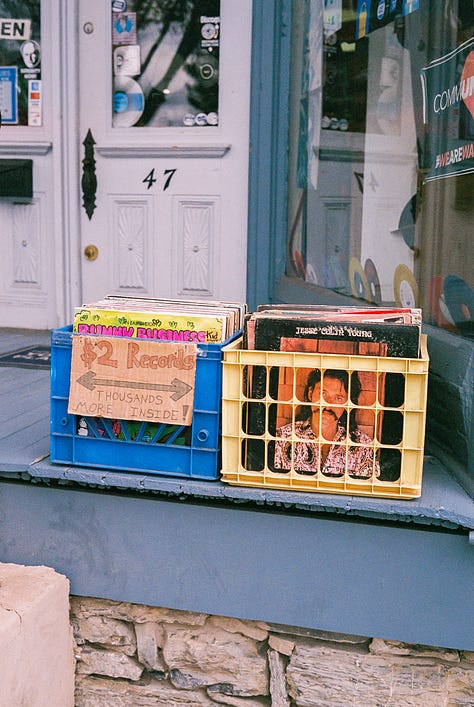
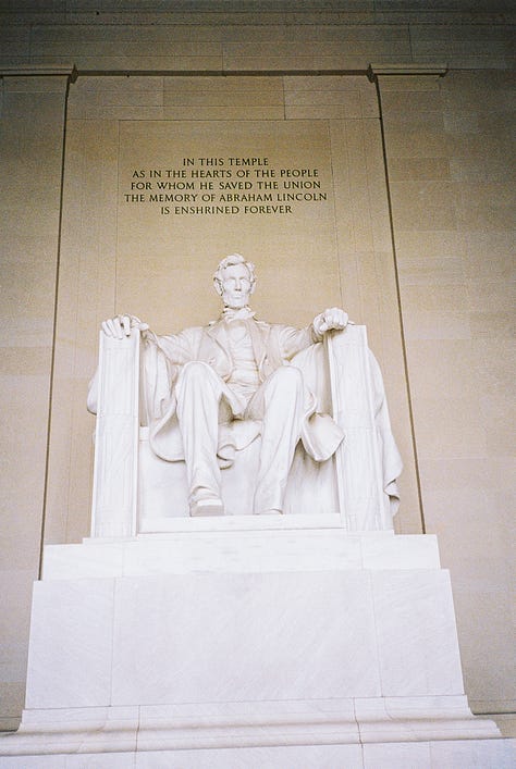
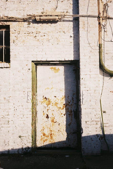
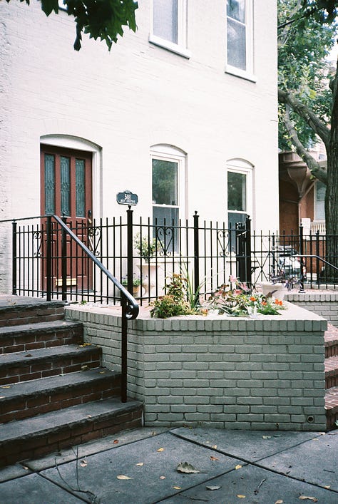
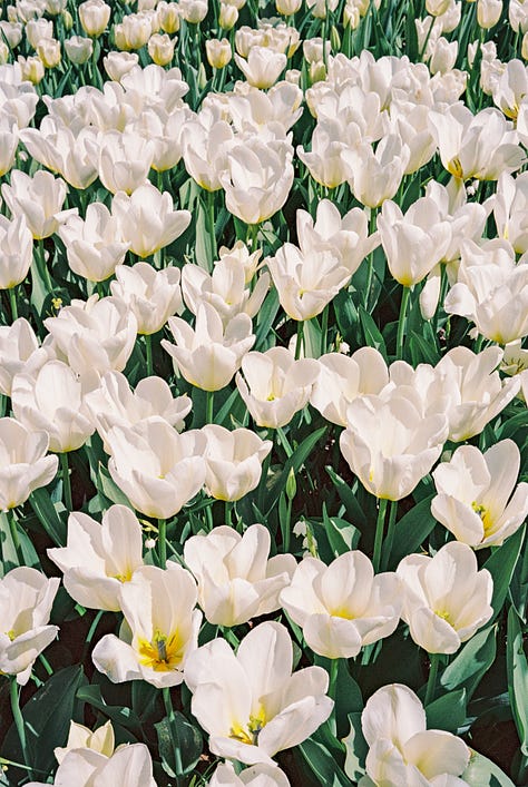
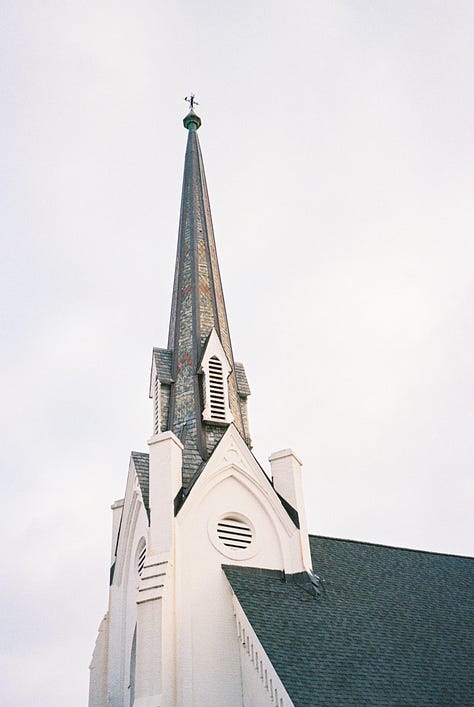
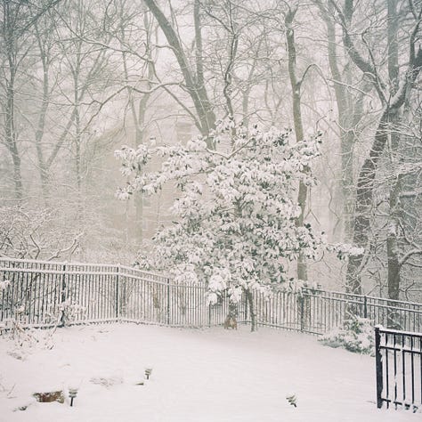
The personality of WHITE
Meditative, Peaceful, Simple, Honest

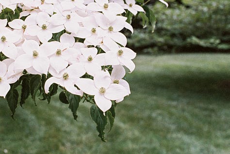

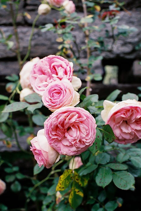
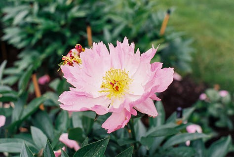
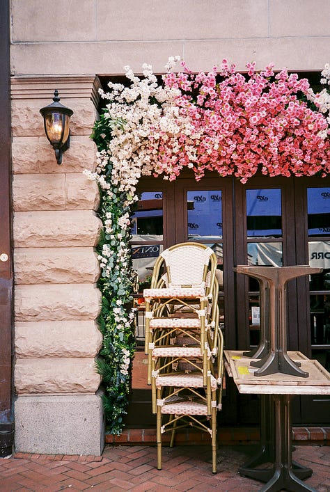
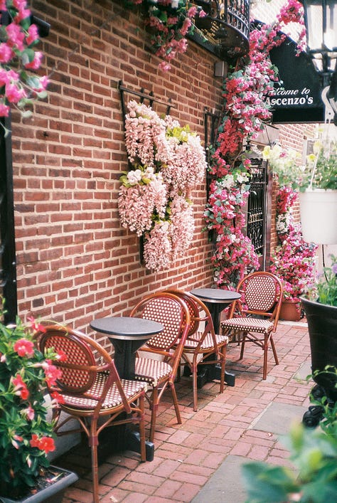
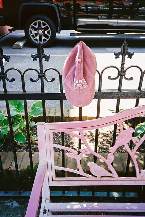
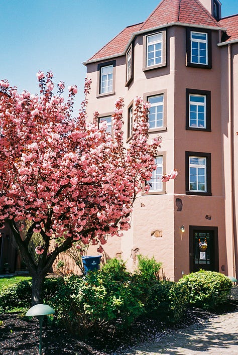
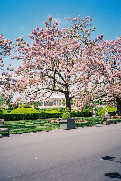
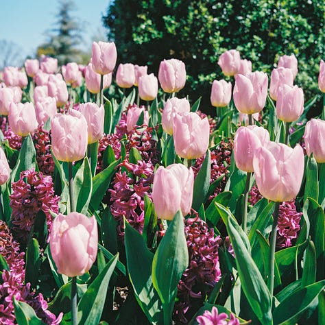
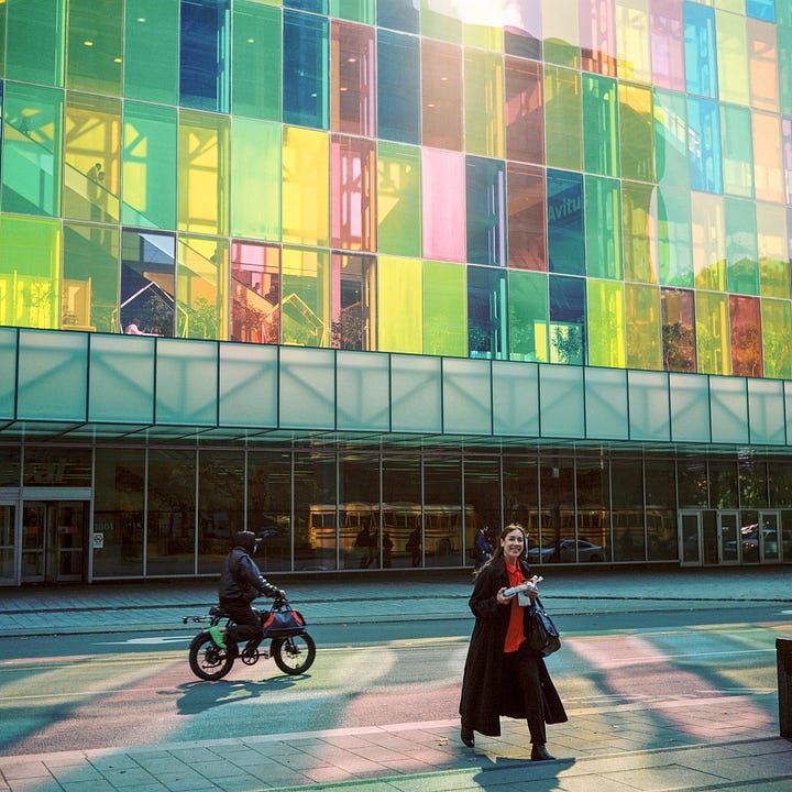
The personality of PINK
Playful, Warm, Compassionate, Sincere

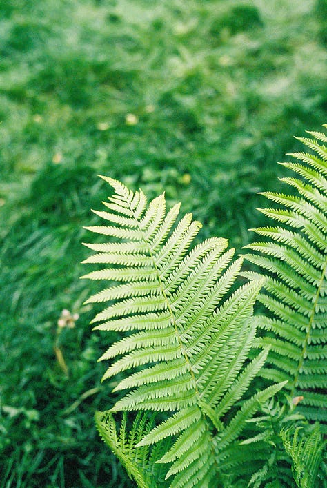
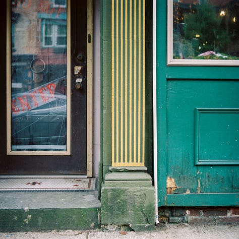
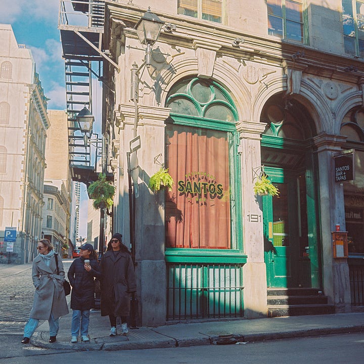
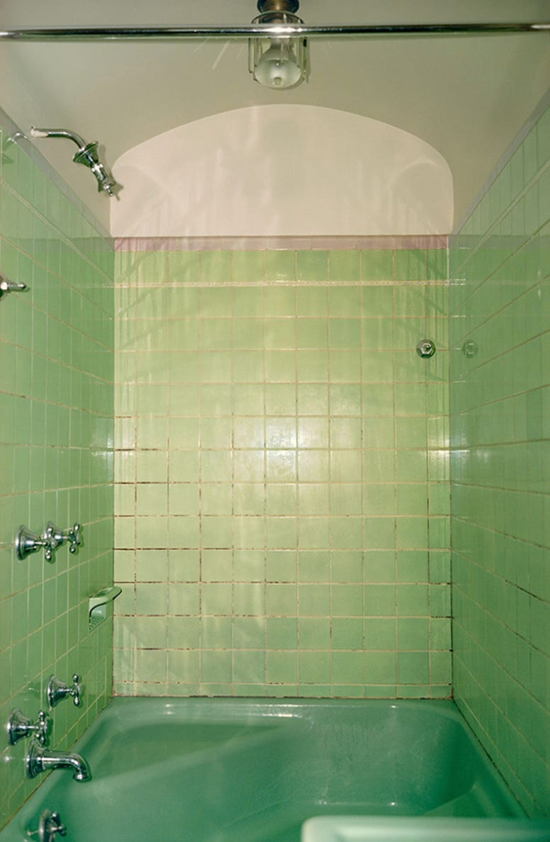
The personality of GREEN
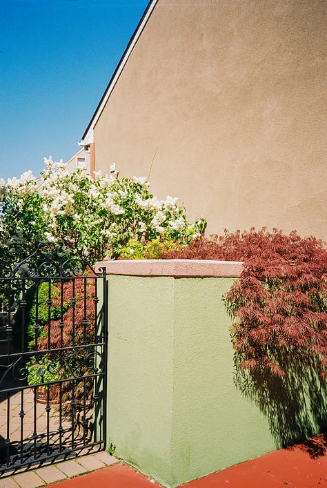
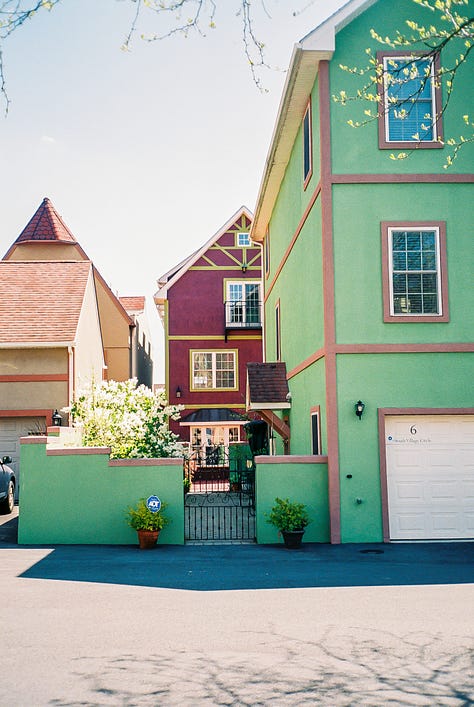
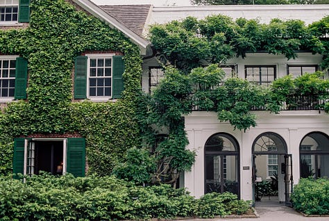
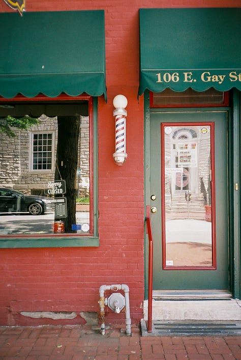
Sustainable, Lucky, Healthy, Fresh
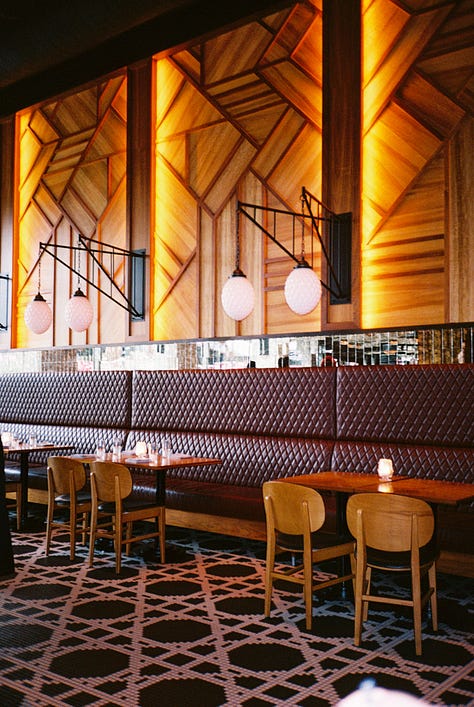
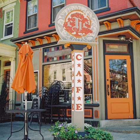
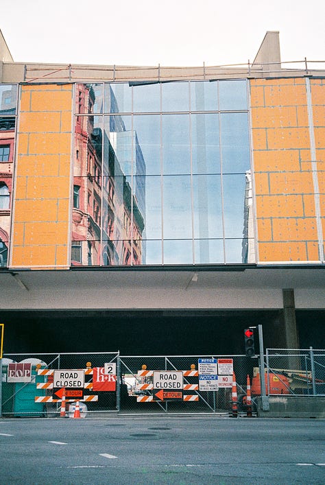
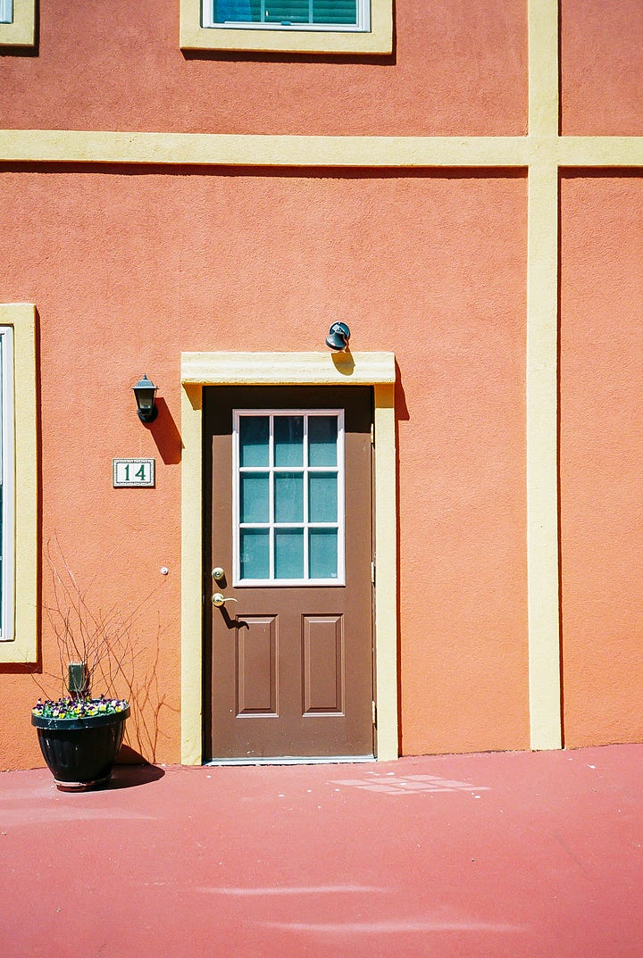
The personality of ORANGE
Cheerful, Energetic, Creative, Confident, Successful

We see color a lot in cinema.
Hollywood cinematographers have a deep connection to and knowledge of color. They utilize it to make us feel things while watching their movies.
One recent example is the show Severance. I am currently obsessed with this show for many reasons, but one of the biggest reasons is its use of color.
In Severance, the main characters work for Lumon Industries on the severance floor. This floor has little decoration besides the desks and uses green and blue extensively.
Green is typically a color of growth and health, but in Severance, each scene is edited with a blue-ish tint. This slight tint shift dramatically changes the meaning and feeling of green to one of suppression and control. It tricks the employees into thinking they can grow at Lumon, but the viewers cannot be disillusioned as they see a different scene that makes them(the viewer) feel isolated, suppressed, and controlled.
Because of Severance's masterful use of color theory, the viewer feels precisely what's happening in Lumon's offices, and it’s not good.
I am so passionate about color in photography because, when harnessed, it’s one of the best storytelling tools.
A couple of years back, I went through my pictures archive and examined the colors in my photos. I found that yellow and white were the two colors I photographed the most.
I didn't feel like I had a creative voice then, but this discovery taught me I did. My photos were simple and honest while joyful and optimistic(all characteristics of yellow and white)—precisely how I wanted to be perceived as a photographer. I thought I was still searching for my creative voice, but color helped me see that I had already found it.
When you look through your pictures, what colors do you see?
Do these colors effectively communicate what is in your heart and what you’re most passionate about?
Do they tell the correct story of who you are and how you want to be seen as a photographer?
When you understand color, you can effectively use it to tell a deeper story, create a mood, or guide a person's eye to other elements in the composition.
So, as we explore the world of color more deeply, I hope this knowledge helps you find a part of your creative voice and encourages you to use color as a form of visual communication.
Your color-obsessed friend,
Razlyn




Awesome read! I don't usually think of color too much unless there is a striking hue that just hits me in the face; I haven't considered the implications of more subtle color, but I must go look for some. Thanks for sharing your deep insights!
This was such a good, interesting read. I think a lot about color ad well. I am drawn to soft, muted tones of nature (on the warmer spectrum). It's what I like to wear, how I decorate my home and what I photograph: it's such a strong part of ME.
I'm excited to read your future posts on color!